Chargebee homepage
Chargebee's homepage scores 8/10: a specific billing headline, analyst badges and named customer stories near the top, repeated demo and trial CTAs; slow lab LCP (lab data, not field).
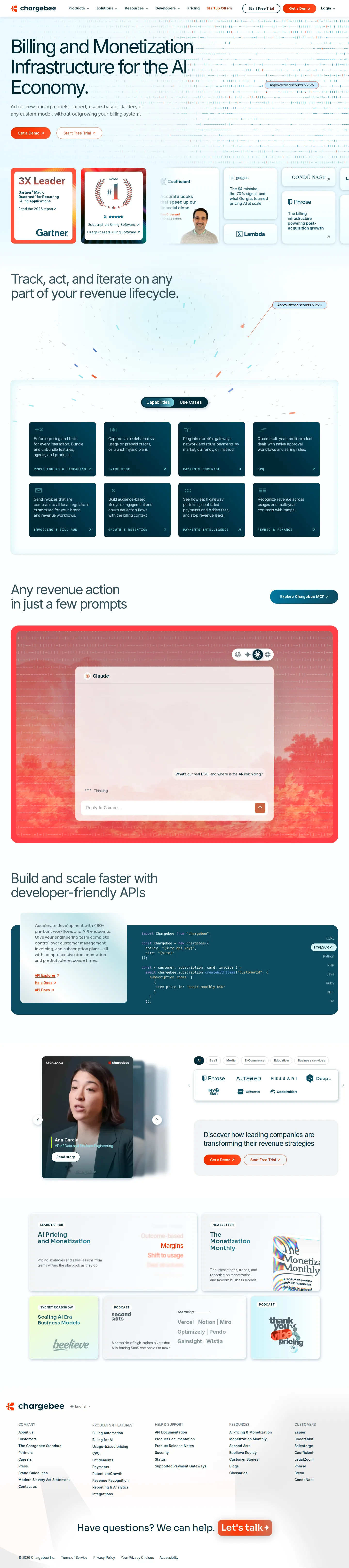

Our own screenshots, taken on the reviewed date. The page may have changed since.
- Message clarity 2/2: The headline names what ("Billing and Monetization Infrastructure") and who ("the AI Economy"); the subhead gives the reason: new pricing models "without outgrowing your billing system."
- Proof 2/2: Gartner and G2 badges, customer cards with named people such as Ben Crosswell at Coefficient, and a LegalZoom video story with Ana Garcia, VP of Data and Platform Engineering.
- Path to contact 2/2: "Get a Demo" in the hero and nav, repeated beside the customer stories, with "Start Free Trial", Pricing and "Let's talk" as other paths.
- Speed 1/2: Lab LCP was 5,952 ms, above the 2,500 ms bar; CLS 0.059 passes (lab data, not field).
- Accessibility basics 1/2: One failure type: 1 empty link. One H1, no heading skips, labelled inputs, lang "en-US".
What the page does well
The headline states the category and the market: "Billing and Monetization Infrastructure for the AI Economy." The subhead lists the pricing models it supports, and "Get a Demo" sits next to "Start Free Trial" in both the hero and the nav. Proof starts in the first screen: a "3X Leader" badge with Gartner Magic Quadrant text, a G2 card reading "Rated #1" with no date shown on the page, and customer cards such as Ben Crosswell at Coefficient. Further down come an API section, a LegalZoom video story with Ana Garcia, VP of Data and Platform Engineering, and industry logo tabs. "Get a Demo" and "Start Free Trial" repeat beside the stories, with "Let's talk" above the footer. Lab LCP was 5,952 ms and CLS 0.059 (lab data, not field).
What to copy:
What we would fix:
Want your page scored the same way?
Send us the page. We score it on the five criteria above and tell you what to fix first.