Clay pricing page
Clay's pricing page scores 7/10: four clear plans with named-customer results, held back by an unexplained "actions" unit, a slow lab LCP and 23 unlabeled inputs.
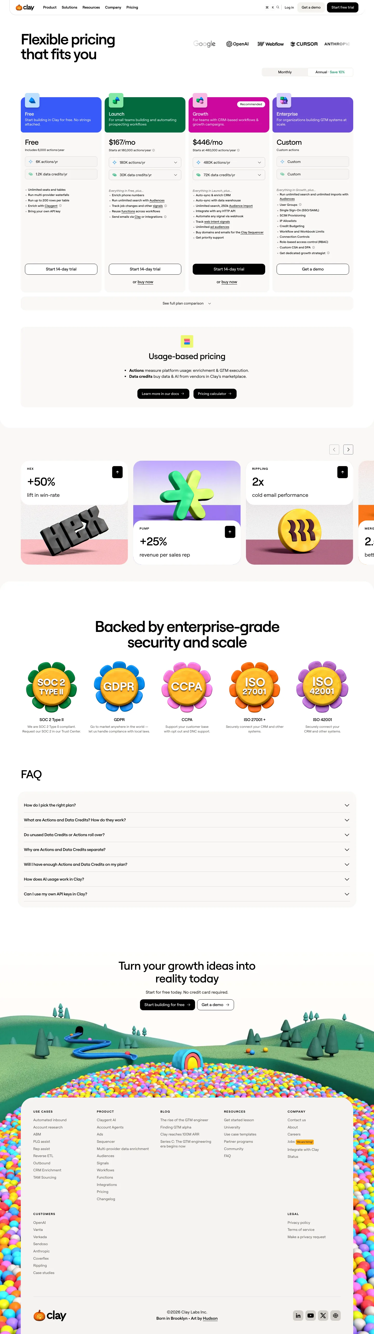

Our own screenshots, taken on the reviewed date. The page may have changed since.
- Message clarity 1/2: Plans, fit notes and monthly prices are on the first screen, but the unit ("actions/yr", "data credits/yr") is only explained after scrolling and per-seat vs per-workspace is not stated.
- Proof 2/2: Named customers with specific results, as claimed on the page ("HEX +50% lift in win-rate", "PUMP +25% revenue per sales rep", "RIPPLING 2x cold email performance") each link out, plus a hero logo row.
- Path to contact 2/2: Every plan has "Start 14-day trial" with "or buy now", Enterprise has "Get a demo", and a Free tier exists; header repeats "Get a demo" and "Start free trial".
- Speed 1/2: Lab LCP 5,252 ms fails the 2,500 ms bar; lab CLS 0 passes (throttled mobile lab run, not field data).
- Accessibility basics 1/2: Two failures: 23 unlabeled inputs and 1 empty link. Images have alt text, no heading skips, one h1, lang set.
What the page does well
Clay's first screen shows four plans with a "Recommended" badge, a Monthly/Annual toggle ("Save 10%") and a one-line fit note per plan, such as "For small teams building and automating prospecting workflows". Prices read "$167/mo" and "$446/mo". The model is usage-based: each plan bundles "actions/yr" and "data credits/yr", but what an action is only appears below the fold in the "Usage-based pricing" block, and the captured page does not say whether the price is per seat or per workspace. Proof is specific: a hero logo row plus result cards like "HEX +50% lift in win-rate" and "RIPPLING 2x cold email performance". One oddity: the Free plan's button also says "Start 14-day trial".
What to copy:
What we would fix:
Want your page scored the same way?
Send us the page. We score it on the five criteria above and tell you what to fix first.