Intercom pricing page
Intercom's pricing page scores 9/10: clear plan ladder, a free trial on every tier, fast in lab and clean on accessibility; held back by a two-part price.
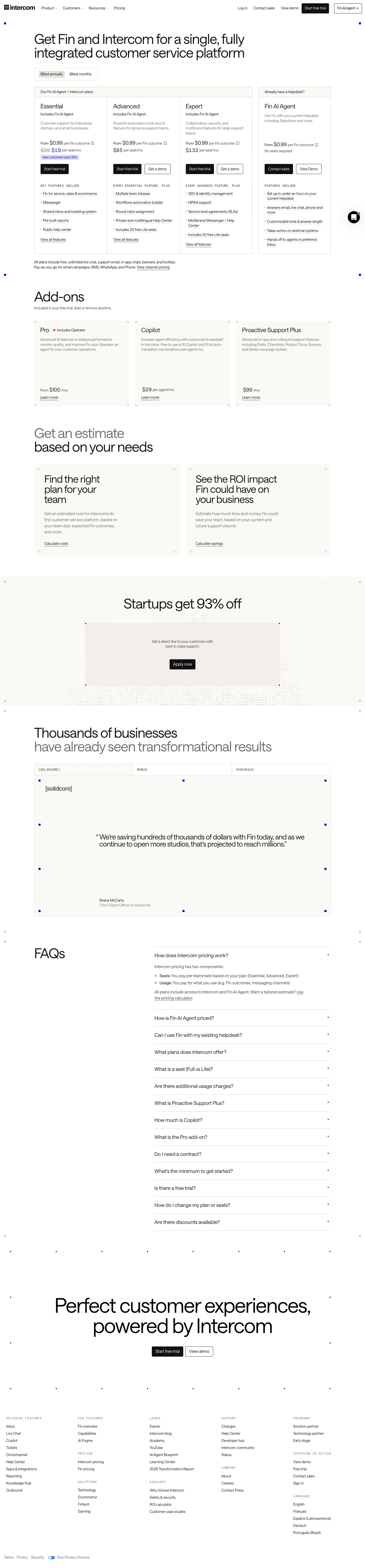

Our own screenshots, taken on the reviewed date. The page may have changed since.
- Message clarity 1/2: plans, audiences, the billing toggle and the per-seat price are all in the first screen, but "per Fin outcome" is a usage unit that needs a tooltip and the calculator before a buyer can estimate a bill.
- Proof 2/2: an attributed quote (Shane McCarty, Chief Digital Officer at [solidcore]) with Robin and Synthesia as further tabs; the "Thousands of businesses" line has no source shown.
- Path to contact 2/2: "Start free trial" and "Get a demo" on each plan, "Contact sales" and "View Demo" on Fin AI Agent, repeated at the foot of the page.
- Speed 2/2: lab LCP 1.0 s and lab CLS 0.003 on throttled mobile, both within target (lab data, not field).
- Accessibility basics 2/2: no failures in the checks: all 7 images have alt text, no unlabeled inputs, no heading skips, no empty links, one h1, lang set.
What the page does well
The first screen does most of the work: a billing toggle, three plans with a one-line audience each ("Customer support for individuals, startups, and small businesses") and a separate "Already have a helpdesk?" column for Fin on its own. Each of the three plans pairs "Start free trial" with "Get a demo", so a buyer never hits a dead end. The model is hybrid: a per-seat price plus "From $0.99 per Fin outcome", a usage unit that needs the info tooltip and the "Calculate costs" tool before a buyer can estimate a monthly bill. Proof is one attributed quote from Shane McCarty of [solidcore], with Robin and Synthesia as tabs; "Thousands of businesses" shows no source. The FAQ explains seats versus usage plainly.
What to copy:
What we would fix:
Want your page scored the same way?
Send us the page. We score it on the five criteria above and tell you what to fix first.