Linear pricing page
Linear's pricing page scores 8/10: four plain-text tiers and a one-click path on every plan, held back by light proof and two small accessibility gaps.
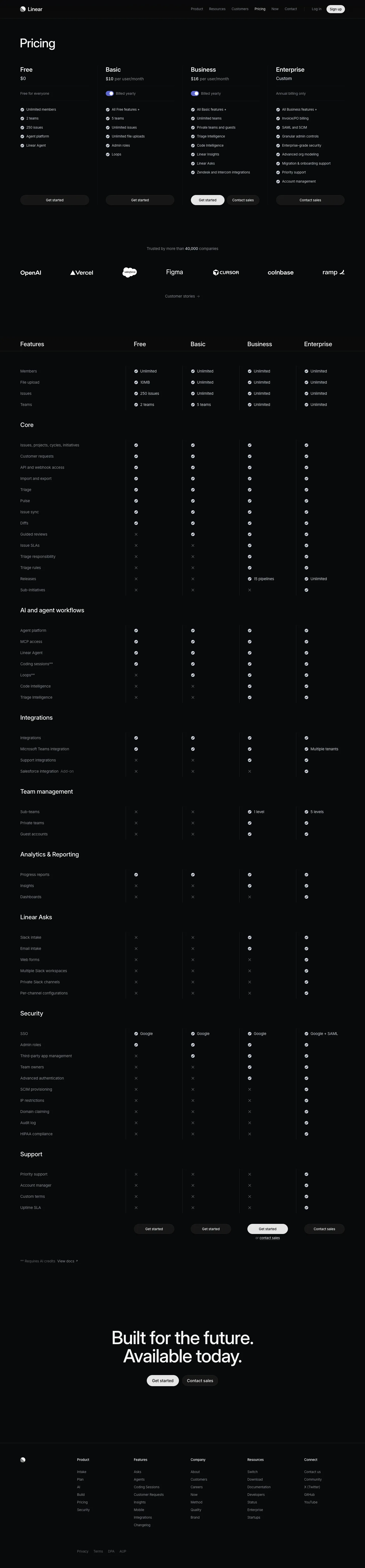

Our own screenshots, taken on the reviewed date. The page may have changed since.
- Message clarity 2/2: plan names, prices, billing period and the limits that change are readable in the first screen.
- Proof 1/2: logos and a "40,000 companies" figure with no source or quote on the page.
- Path to contact 2/2: one primary action per plan, a free tier as the low-commitment route, and the buttons repeat after the feature table.
- Speed 2/2: lab LCP 1.7 s and CLS 0 on a throttled 390px mobile run (lab data, not field data).
- Accessibility 1/2: one form control without a label, one heading-level skip and two links with no text.
What the page does well
Linear's pricing page is the minimalist benchmark: four columns, no images, and every limit stated in words ("2 teams", "250 issues", "Unlimited file uploads"). The billed-yearly toggle sits inside each paid column, so the price you see is the price you pay. Proof is one line, "Trusted by more than 40,000 companies", with six logos and a link to customer stories; it does the job without a testimonial carousel. The long feature matrix below is grouped by capability (Core, AI and agent workflows, Security, Support), which answers "what do I lose on Free" faster than a per-plan list would. Every self-serve tier ends in "Get started"; only Enterprise is contact-sales.
What to copy:
What we would fix:
Want your page scored the same way?
Send us the page. We score it on the five criteria above and tell you what to fix first.