Mercury pricing page
Mercury's pricing page scores 7/10: a $0 baseline and three plainly priced tiers with good lab speed, held back by no visible customer proof and four h1s.
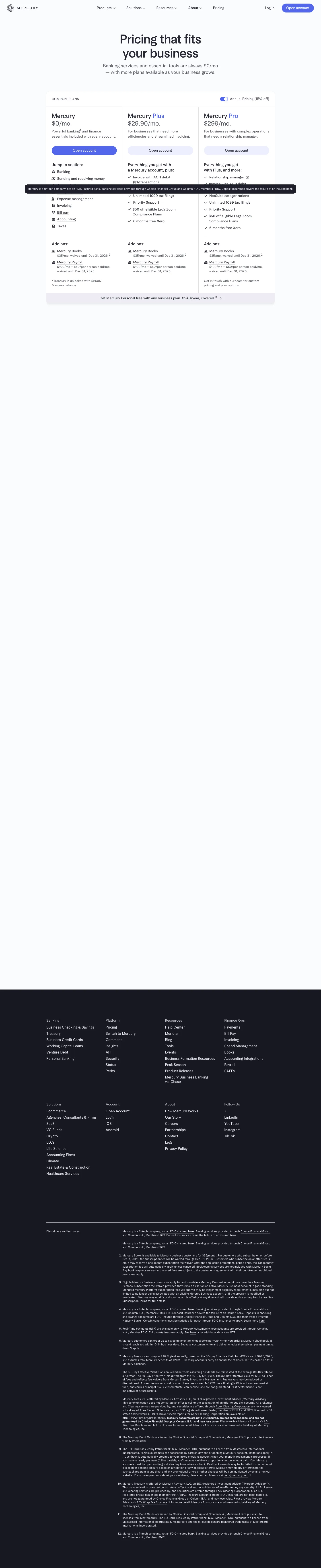

Our own screenshots, taken on the reviewed date. The page may have changed since.
- Message clarity 2/2: Three prices per month on the first screen ($0, $29.90, $299), a one-line fit per card ("For businesses that need more efficiencies and streamlined invoicing") and the "Annual Pricing (15% off)" toggle visible beside them.
- Proof 0/2: No named customers, numbers with a source, quotes or reviews are visible in the capture; the footer carries regulatory disclosures only.
- Path to contact 2/2: One "Open account" button per card, the $0 plan as the low-commitment option, and "Get in touch" on Pro for custom pricing.
- Speed 2/2: Lab LCP 2,388 ms on throttled mobile and lab CLS 0 both pass (lab data, not field).
- Accessibility basics 1/2: Two failures: four h1 elements and four empty links. Images have alt text, there are no inputs, no heading skips, and lang is set.
What the page does well
Mercury's first screen answers the main question in one line: "Banking services and essential tools are always $0/mo". Three cards follow, "Mercury" at $0/mo., "Mercury Plus" at $29.90/mo. and "Mercury Pro" at $299/mo., with an "Annual Pricing (15% off)" toggle on by default, so the monthly-billing figure takes a click to see. Add-ons are priced on the card itself ("Mercury Books", "$35/mo, waived until Dec 31, 2026"), and Pro offers "Get in touch" for custom pricing. All three buttons read "Open account", so the button does not say which plan a buyer is choosing. In our capture no customer names or quotes appear, and a fixed disclaimer bar covers part of the first card's "Jump to section" links.
What to copy:
What we would fix:
Want your page scored the same way?
Send us the page. We score it on the five criteria above and tell you what to fix first.