PostHog pricing page
PostHog's pricing page scores 5/10 on its first screen only: a bold free-first message, but no prices visible, a 97% claim with no source shown, and an 18 s lab LCP.
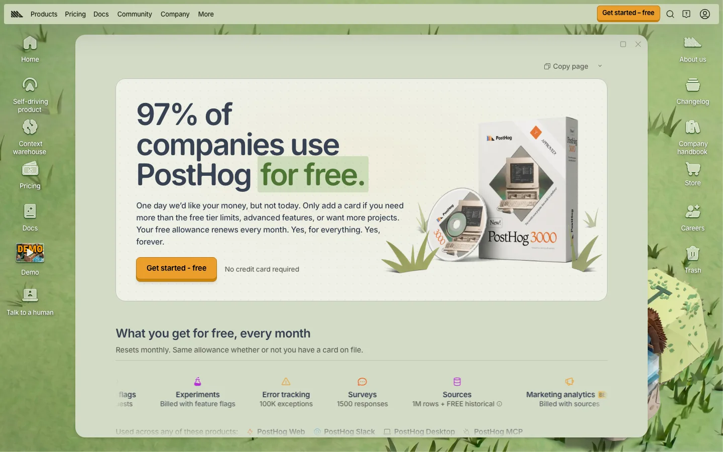
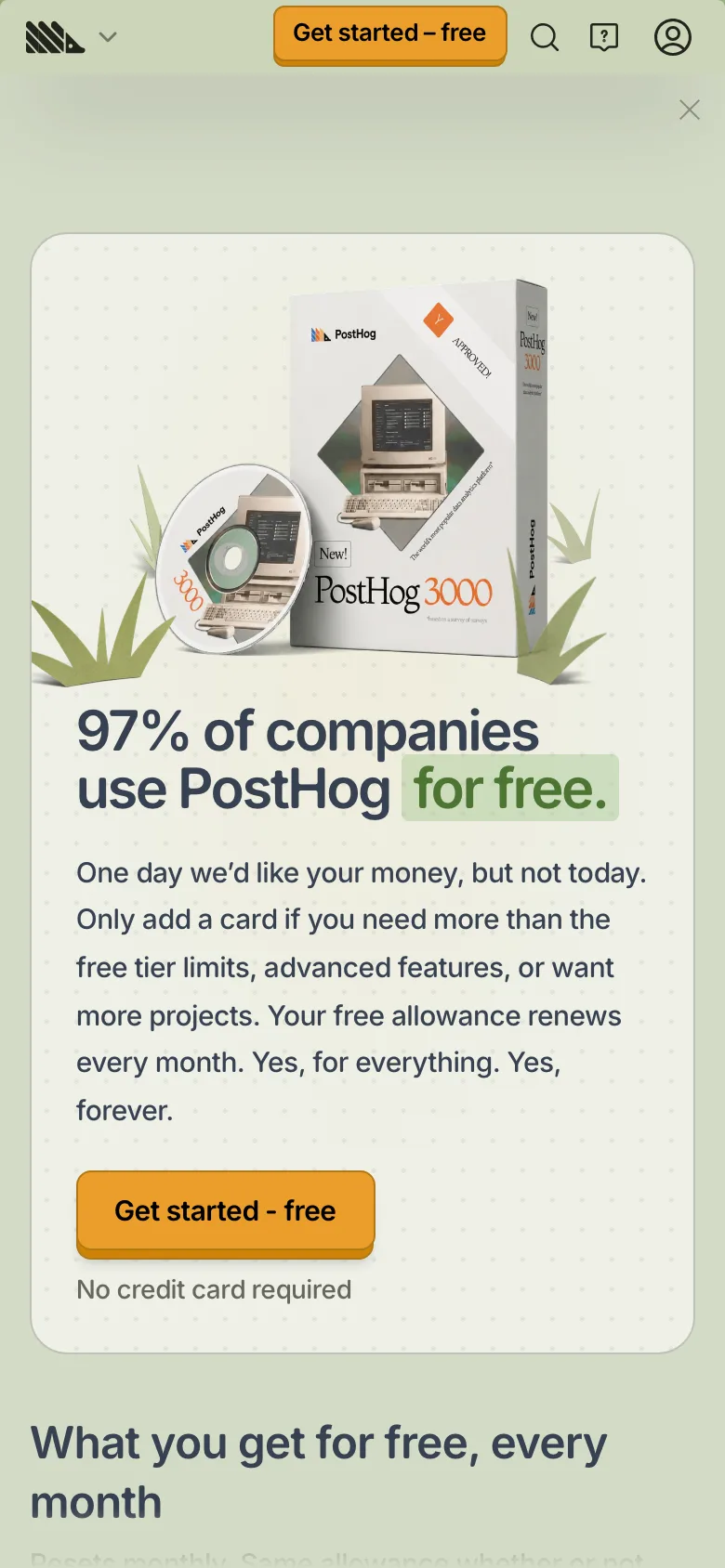
Our own screenshots, taken on the reviewed date. The page may have changed since.
- Message clarity 1/2: The free offer is clear, but no paid price, unit rate or plan is visible in the first screen; a buyer must scroll to learn what it costs beyond the free tier.
- Proof 1/2: "97% of companies use PostHog for free" is a specific number but no source is shown; no named customers or quotes are visible in the captured screen.
- Path to contact 1/2: "Get started - free" with "No credit card required" and a sidebar "Talk to a human" exist, but no per-plan actions are visible in the captured screen.
- Speed 1/2: Lab LCP 18,164 ms fails badly; lab CLS 0.007 passes (throttled mobile lab run, not field data).
- Accessibility basics 1/2: Two failures: 1 image without alt text and 1 empty link. Inputs are labelled, no heading skips, one h1, lang set.
What the page does well
PostHog's first screen is a headline, "97% of companies use PostHog for free.", and a plain-spoken paragraph: "One day we'd like your money, but not today." Below it, "What you get for free, every month" lists per-product allowances such as "100K exceptions" and "1500 responses". The visible screen lists per-product free monthly allowances, but no paid rate or plan appears in it, so a buyer cannot yet tell what scale would cost. The single path is "Get started - free" with "No credit card required", plus a sidebar "Talk to a human". The page renders inside a desktop-style window that scrolls internally, which stopped our full-page capture at the first screen.
What to copy:
What we would fix:
Want your page scored the same way?
Send us the page. We score it on the five criteria above and tell you what to fix first.