All examples/Scored examples

15 B2B SaaS website examples, scored on one rubric

15 real B2B SaaS homepages, from developer tools and infrastructure to revenue, support, HR and enterprise AI platforms. Each has our own screenshots, a short critique and a score out of 10 on five criteria: message clarity, proof, path to contact, speed and accessibility basics. Most of these pages pair a demo button with a lower-commitment step, and each says in its own way what the product does.

Reviewed
November 22, 2026
by
Rehan Khurshid
How we score
Deel homepage
Deel
Homepage

Deel homepage

10
/10Message
2
Proof
2
Path
2
Speed
2
Access
2

Deel's headline lists what the product does: "Hire, manage, pay, & equip anyone, anywhere." Under it, the question "What would you like to do with Deel?" offers five choices, from "Hire anywhere" to "Ship equipment", above a "Book a demo" button and two review ratings, including G2 at "4.7/5 | 16K+ Reviews". A quote from Shiv Verma, SVP of Finance, with a Robinhood label, sits on the hero image. Lower down, a Revolut story says the team "hired 150+ workers", and stats such as "+40,000 customers" and "$20B+" processed payroll appear, all with no source shown on the page. "Book a demo" repeats under the stats. Lab LCP was 684 ms with CLS 0.001 (lab data, not field). In the capture the Revolut video panel is black.

What to copy:

Ask "What would you like to do with Deel?" with task buttons in the hero, so each visitor picks a route before the demo ask.

What we would fix:

Show a source or date next to "+40,000 customers" and "$20B+", and check that the Revolut video shows a poster image before it plays (it rendered black in the capture).

Gong homepage
Gong
Homepage

Gong homepage

9
/10Message
2
Proof
2
Path
2
Speed
1
Access
2

Gong's first screen pairs the headline "More wins, less work." with a line that says what the product does: Gong "learns from every call, email and meeting, and its agents work alongside your reps". A G2 rating "Based on 6,278 reviews" sits above the headline, and "Book a demo" plus "Explore the platform" sit below it. Proof further down is strong: an Anthropic block with "64% increase in productivity", with no source shown on the page and a quote from Kevin Jordan, then named quotes from people at Uber for Business, HubSpot, SurveyMonkey and Frontline Education. The demo ask returns as a work-email form near the footer. The weak point in the capture is speed: lab LCP was 12,632 ms (lab data, not field), well above the 2,500 ms mark.

What to copy:

Put a third-party rating with its review count directly above the headline, so proof is visible before the visitor reads the pitch.

What we would fix:

Bring lab LCP (lab data, not field) under 2,500 ms by checking what loads before the hero headline and product preview on mobile.

Inngest homepage
Inngest
Homepage

Inngest homepage

9
/10Message
2
Proof
2
Path
2
Speed
1
Access
2

The first screen shows an install command and a code sample. Under "Open source durable execution" and the headline "Make every backend unbreakable.", the subhead says "Inngest is the fastest way to orchestrate all your async code." A copyable "npm install inngest" button sits next to "Start free", with a "Trusted in production by" logo row below. A quote from Sully Omar, attributed on the page as "Co-founder - Otto (Acquired by Cohere)", adds a named voice, and a "Stuff your CISO needs to see" block lists SOC 2, SSO and HIPAA BAA. "100K+ Executions per second" appears with no source shown on the page. A video block shows only a loading spinner in the capture. Lab LCP was 4,628 ms (lab data, not field).

What to copy:

Pair the sign-up button with a copyable install command so developers can start from their own terminal straight from the first screen.

What we would fix:

Name the audience in the subhead, so the first line says who Inngest is for as well as what it does.

Mintlify homepage
Mintlify
Homepage

Mintlify homepage

9
/10Message
2
Proof
2
Path
2
Speed
1
Access
2

The first screen reads "The intelligent documentation platform" with the line "Self-updating documentation for startups, enterprises, and agents." A screenshot sits beside "Get started" and "Sign up with Google", with "Contact sales" in the header. Below, "Join 20,000+ of the world's most ambitious companies" sits by logos, with no source shown on the page. The "One platform for your entire knowledge stack" tiles show in the capture, though one tile still shows grey placeholder UI. Then come an Anthropic case study card, startup story cards (Lovable, Kalshi, Decagon, Replit) and a testimonial wall; in the capture two of six cards are legible, from Taylor Halliday, CEO of Ravenna, and Nicolas Machado of Lume AI. An FAQ covers free use and self-hosting. Lab LCP was 7,564 ms (lab data, not field).

What to copy:

Name the audiences right in the subhead, as "for startups, enterprises, and agents" does, so each visitor sees themselves in the first line.

What we would fix:

Cut lab LCP (lab data, not field) from 7,564 ms to under 2,500 ms by checking what loads before the hero product screenshot on mobile.

Pylon homepage
Pylon
Homepage

Pylon homepage

9
/10Message
2
Proof
2
Path
2
Speed
2
Access
1

The first screen labels the product "The Agentic Support Platform" above the headline "The new way to run customer support." The subhead adds "Pylon lets humans and agents collaborate on customer work", and "Book a demo" and "View walkthrough" sit beside it. "Trusted by 1,800+ B2B customers globally" introduces the logo strip, a number with no source shown on the page. A cookie banner covers the lower right of the first screen in the capture. Further down, an integrations table lists tools such as Slack, Salesforce and Jira, and an attributed quote from Cognition's Head of Support Engineering appears. The page closes with an email field and "Book a demo". Lab LCP was 1,732 ms (lab data, not field).

What to copy:

Offer a low-commitment "View walkthrough" next to "Book a demo" so visitors who are not ready to talk can still see the product.

What we would fix:

In the capture, one attributed quote appears, near the bottom; move it, or a named result, up near the logo strip.

Retool homepage
Retool
Homepage

Retool homepage

9
/10Message
1
Proof
2
Path
2
Speed
2
Access
2

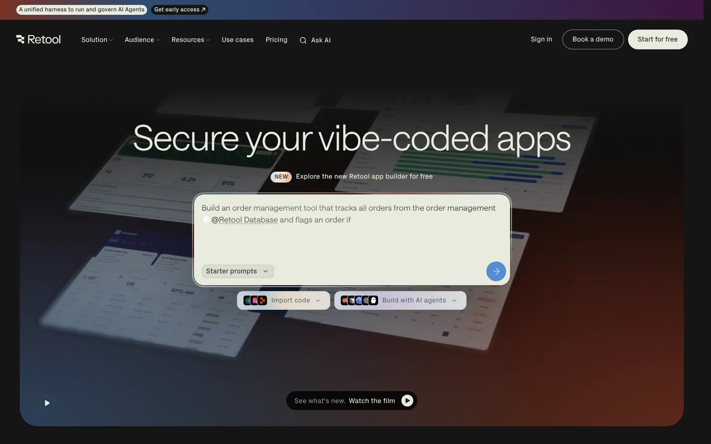
Retool's headline is "Secure your vibe-coded apps", with "Explore the new Retool app builder for free" and a prompt box below it. The page title says "Build internal software better, with AI", but the first screen does not say who the builder is for. "Start for free" and "Book a demo" sit in the header and footer, and a "Start today" prompt box repeats the hero. "Why enterprises choose Retool" leads into a grid of named results such as "Ramp saved $8M and 20,000+ hours" and "Doordash saved $6M and 36,000+ hours", with no source shown on the page. In the capture, text beside three product panels and one dark band is blank. Median lab LCP over three runs was 1,944 ms, with CLS 0 (lab data, not field).

What to copy:

Pair each customer logo with one result in a grid, as "Ramp saved $8M and 20,000+ hours" does, so the proof reads as outcomes, not just names.

What we would fix:

Add a line under "Secure your vibe-coded apps" that names who it is for and what they build, such as the internal software named in the page title.

WorkOS homepage
WorkOS
Homepage

WorkOS homepage

9
/10Message
2
Proof
2
Path
2
Speed
2
Access
1

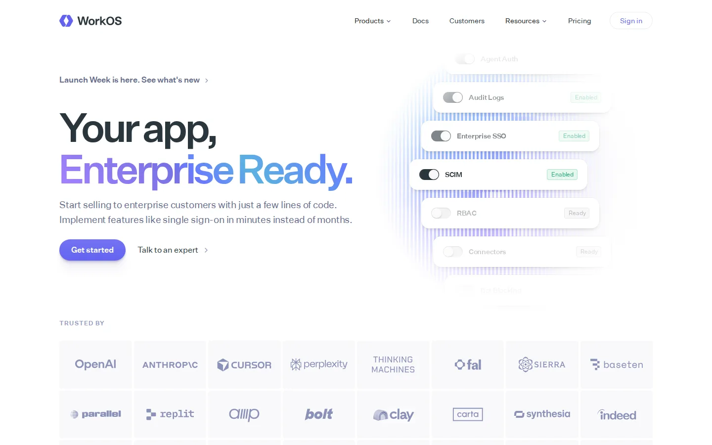
The first screen says "Your app, Enterprise Ready." and then explains it in plain words: "Start selling to enterprise customers with just a few lines of code. Implement features like single sign-on in minutes instead of months." A toggle list (Audit Logs, Enterprise SSO, SCIM, RBAC) shows the features at a glance, and a large logo grid sits just under the buttons. Each product section below carries its own action, such as "Add Single Sign-On to your app" and "Try a live demo", and a code sample with "Read the docs" serves developers. The only attributed quote in the capture comes from Perplexity's Chief Business Officer, near the bottom. Median lab LCP over three runs was 2,424 ms (lab data, not field); one link has no text.

What to copy:

Pair a short headline with a plain sentence that names the buyer, the feature and the time saved, as "in minutes instead of months" does here.

What we would fix:

Move the Perplexity quote, or a second named quote, up near the logo grid so attributed proof appears before the long product sections.

Ashby homepage
Ashby
Homepage

Ashby homepage

8
/10Message
2
Proof
2
Path
2
Speed
1
Access
1

The first screen leads with "What an ATS should be." and a subhead that names the product and the buyer: "The all-in-one recruiting platform that evolves at the speed of AI", for "ambitious teams from Startups to Enterprises." An email field with "Get in Touch" sits under it, followed by two rows of customer logos. A quote carousel with NETGEAR, Vanta, Oyster, Clay and Dave tabs shows, in the capture, Liz Wagner of Vanta: "We can do it all with Ashby." A customer video features Jordan Wong of Hiya. The page closes with "Hiring excellence is one conversation away." and a second "Get in Touch" button. Lab LCP was 7,064 ms and CLS 0.001 (lab data, not field).

What to copy:

Put the category name in the headline ("What an ATS should be.") so buyers know the product type before they read anything else.

What we would fix:

Move one named customer quote closer to the first screen and add alt text to the three images that are missing it.

Chargebee homepage
Chargebee
Homepage

Chargebee homepage

8
/10Message
2
Proof
2
Path
2
Speed
1
Access
1

The headline states the category and the market: "Billing and Monetization Infrastructure for the AI Economy." The subhead lists the pricing models it supports, and "Get a Demo" sits next to "Start Free Trial" in both the hero and the nav. Proof starts in the first screen: a "3X Leader" badge with Gartner Magic Quadrant text, a G2 card reading "Rated #1" with no date shown on the page, and customer cards such as Ben Crosswell at Coefficient. Further down come an API section, a LegalZoom video story with Ana Garcia, VP of Data and Platform Engineering, and industry logo tabs. "Get a Demo" and "Start Free Trial" repeat beside the stories, with "Let's talk" above the footer. Lab LCP was 5,952 ms and CLS 0.059 (lab data, not field).

What to copy:

Place analyst badges and named customer cards directly under the hero buttons so proof is visible before the first scroll.

What we would fix:

Cut the time to the main hero content (lab LCP 5,952 ms, lab data, not field) and give the one empty link accessible text.

Lattice homepage
Lattice
Homepage

Lattice homepage

8
/10Message
1
Proof
2
Path
2
Speed
1
Access
2

Lattice opens with the headline "People + AI: Succeeding Together", which does not say what is sold. The subhead does that work: "Join 5,000+ forward-thinking teams using Lattice’s HR and AI tools to manage people and performance"; the 5,000+ is a number with no source shown on the page. "Request a demo" and "Take a tour" sit side by side, and both return in the closing band (as "Take a free tour") next to "3300+ 5-star G2 reviews". Customer stories add named results, such as "USAirtours increased sales by 20%." from Guy Novik; that result and the G2 count have no source shown on the page. Product cards for Performance, Goals and OKRs, Engagement, Grow and Compensation show the scope. Lab LCP was 5,744 ms (lab data, not field).

What to copy:

Offer "Take a tour" next to "Request a demo" in the hero and again in the closing band, so visitors not ready to talk still have a next step.

What we would fix:

Replace the abstract headline with one that names the product, HR and performance software, and bring lab LCP (lab data, not field) under 2,500 ms.

Plain homepage
Plain
Homepage

Plain homepage

8
/10Message
2
Proof
2
Path
2
Speed
1
Access
1

The first screen reads "Support infrastructure for humans & agents" and explains: "Plain is the agentic platform to orchestrate customer work. Turn every conversation into faster answers, better products, and customers who stay." "Book a demo" and "Try for free" sit under it, above a logo strip headed "Trusted by thousands of B2B companies globally", with no source shown on the page. Further down: an attributed quote from Sourcegraph's Head of Support Engineering, then named results such as "Vercel's customers get issues resolved 50% faster", a figure with no source shown on the page beyond a link to each customer story. "Book a demo" and "Start for free" close the page. Lab LCP was 15,400 ms (lab data, not field), and 12 links have no text.

What to copy:

Put each named customer next to one specific result and a "Read more" link, as the Vercel, n8n, Resend and Voltage Park cards do.

What we would fix:

Bring lab LCP (lab data, not field) down from 15,400 ms and give the 12 empty links readable text so screen readers can announce them.

Clerk homepage
Clerk
Homepage

Clerk homepage

7
/10Message
2
Proof
2
Path
1
Speed
1
Access
1

Clerk's headline is plain: "Everything you need for authentication", followed by "More than APIs. The complete user layer for modern apps." A sign-up component under it shows the product. The hero has no primary button; the next steps are "Sign up" as a text link in the header, Docs and Pricing in the nav, and "Copy prompt" for AI coding agents. Proof in the capture includes a customer logo row, a quote from Paul Copplestone, "Supabase, CEO", and developer posts with names and handles. An FAQ and the line "Free for your first 50,000 monthly retained users" appear in the capture. Lab LCP was 4,704 ms (lab data, not field); the rendered page has eight H1 elements, seven inside the embedded sign-in demos.

What to copy:

Show the real product component in the hero, here a sign-up form, so developers see what they would ship before reading feature copy.

What we would fix:

Add a visible sign-up button in the hero, repeat it after the testimonials, keep a single H1 and bring lab LCP (lab data, not field) under 2,500 ms.

Dub homepage
Dub
Homepage

Dub homepage

7
/10Message
1
Proof
2
Path
2
Speed
1
Access
1

The headline "Turn clicks into revenue" is backed by a precise subhead: "Dub is the modern link attribution platform for short links, conversion tracking, and affiliate programs." "Start for free" and "Get a demo" sit side by side, with a tabbed product view below. In the capture, the buyer is first named as "modern marketing teams" in the closing band. Each product section ends with an attributed quote, including Johnny Ho, Co-founder at Perplexity, and Koen Bok, CEO at Framer. Counters for links and revenue tracked, "100,000+ customers" and "Boost click-through rates by 30%" appear with no source shown on the page. A changelog lists recent releases. The browser reported no LCP in two lab runs, but first contentful paint alone took 6,428 ms (lab data, not field).

What to copy:

Close each product section with a quote from a named customer about that product, so proof sits next to the claim it supports.

What we would fix:

Name the buyer in the first screen, add a label to the email input and give the 12 empty links accessible text.

Glean homepage
Glean
Homepage

Glean homepage

7
/10Message
1
Proof
2
Path
2
Speed
1
Access
1

The eyebrow reads "Enterprise AI that understands your company" and the headline "Complete context that makes AI work at enterprise scale." Both say the buyer is an enterprise, but a reader has to infer what the product does from the search box mockup and app chips below. "Get a demo" and "See how it works" sit together, and a chat assistant panel overlaps the hero in the capture. Further down, the page carries a lot of proof: a DBS Bank quote from Nimish Panchmatia and a Booking.com story with figures. Those figures and stats such as "110 hours" saved per user a year have no source shown on the page. Lab LCP was 22,784 ms, and 21,748 ms on a second run (lab data, not field).

What to copy:

Expand one customer story inline, as with Booking.com, with three figures and a link to the story, and keep the other stories as one-line headlines beneath it.

What we would fix:

Say in the headline what the product does, such as the search shown in the mockup, and give the 26 empty links accessible text.

Hex homepage
Hex
Homepage

Hex homepage

6
/10Message
1
Proof
2
Path
2
Speed
1
Access
0

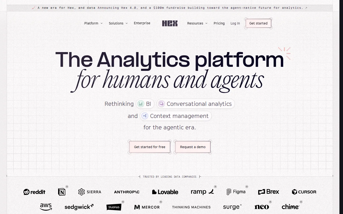
The first screen reads "The Analytics platform for humans and agents" followed by "Rethinking BI, Conversational analytics and Context management for the agentic era." It names the category but not the buyer, and the gain stays vague ("agentic era"). "Get started for free" and "Request a demo" sit under it, above a logo band "Trusted by leading data companies". Below, the feature blocks pair a product mock with an attributed quote (LangChain, Zoe, Figma, Chime, Mercor, Algolia). Further down, the capture shows use cases, "Loved by the best data teams" story cards, G2 badges, a Notion quote, integrations, a closing CTA band and an FAQ. Lab LCP was 16,932 ms (lab data, not field), and images without alt, a heading skip and empty links show up.

What to copy:

Pair every feature block with an attributed quote from a named customer, as Hex does from the first feature section down.

What we would fix:

Name the buyer and the result in the first screen, for example which data teams it serves and what they get, in place of "for the agentic era".

What to copy from these pages

  • If the headline is a brand line, let the subhead say plainly what the product does and who it is for, as Gong does.
  • Offer a lower-commitment step next to the demo button, such as "Take a tour", "View walkthrough", "Start for free" or a copyable install command.
  • Pair named customers with one specific result each, and put attributed quotes next to the feature they describe.
  • Show a source or date next to ratings and big numbers instead of a bare badge or figure.

Questions about these examples

How are these B2B SaaS homepages scored?

Each page gets 0, 1 or 2 points on five criteria, for a score out of 10. The rubric and the method are published on the examples hub, and every score is checked by a person before a page is published.

Why do most of these pages lose a point on speed?

In our lab run (390px mobile, 4x CPU throttle, about 1.6 Mbps), 11 of the 15 homepages did not reach their largest visible element within 2.5 seconds (median of three runs for the two pages close to the line). For Dub, which reported no largest element, first contentful paint alone took 6.4 seconds. Lab numbers are not field data from real visitors, so treat them as a comparison across the set, not a verdict on any one site.

Are the screenshots current?

They are our own captures, taken on the reviewed date shown on each teardown. Pages change; each teardown links to the live page so you can compare.

Can you score our homepage?

Yes. Send us the page and we score it on the same five criteria and tell you what to fix first.

Get your page scored with the same rubric

Send us the page you want reviewed. We score it on message clarity, proof, path to contact, speed and accessibility, and tell you what to fix first.

Get a Free Conversion Audit