How Do You Build a Variable-Based Style Guide in Webflow?


Define your design tokens as Webflow variables before you build any page: colours, sizes, percentages, numbers and font families. Group them, use modes for themes or breakpoints, and put clamp() inside size variables where type and spacing should scale with the screen. Then bind tag styles and a short list of utility classes to those variables, build components on top, and document all of it on one style guide page. Change a variable once and every element linked to it updates.
This guide is for the person who owns brand consistency on a Webflow marketing site: a designer, or a marketing lead who keeps finding five slightly different blues. It walks through the order we use, from tokens to a documented style guide page, and links Webflow's own documentation for every platform detail.
What are Webflow variables, and why start there?
A variable is a named value you set once and reuse across the site. Webflow's Variables documentation lists five types: colour, size, percentage, number and font. The same page states the property that makes them worth the setup: “When you update a variable value, that change is updated everywhere it’s used on your site.”
That is why variables come first. If a heading size or a brand colour lives inside fifty classes as a raw value, changing it means finding fifty classes. If it lives in one variable, the change is one edit. Building pages first and extracting tokens later almost always leaves stray hard-coded values behind.
It also matters for the people who maintain the site. In Webflow's survey report with Vanson Bourne, The 2026 State of the Website (survey June to July 2025), marketers ranked “Creating, managing, and updating page templates” second among their most time-consuming website tasks. A token system will not remove that work, but it makes each template change smaller and safer.

Which variables does a B2B marketing site need?
Fewer than most teams expect. A practical starting set:
| Group | What it holds | Example names |
|---|---|---|
| Colour primitives | The raw brand and neutral palette | base/brand-blue, base/neutral-100 |
| Semantic colours | Roles that point at primitives | text/primary, background/alternate, border/primary |
| Spacing | A short scale for padding, margin and gaps | space/8, space/16, space/32 |
| Type sizes | Body and heading sizes | text/regular, heading/h2 |
| Radius and borders | Corner and line values | radius/small, border/width |
| Font families | Heading and body faces | font/heading, font/body |
| Numbers | Font weights and line heights | weight/semibold, line-height/tight |
Two rules keep this manageable.
Separate primitives from roles. Primitives describe what a colour is; semantic variables describe what it does. Webflow supports this through aliases, which are variables that reference other variables of the same type. Your text/primary alias points at base/neutral-900; if the brand team darkens that neutral, every text colour follows. Aliases only work within a type, so a colour variable can reference a colour variable but not a size.
Name for grouping. Webflow groups variables when you name them in the format group name/variable name, so Colors/Red and Colors/Blue appear together in a Colors section of the Variables panel. Webflow's own design system article recommends a consistent naming structure, with examples such as color-primary and spacing-lg. Pick one pattern, write it down and do not mix styles.
How do variable modes handle themes and breakpoints?
Modes let one variable hold more than one value. In Webflow's words, from Using a design system in Webflow: “Variable modes let you adjust values based on design context (e.g., light vs. dark themes or responsive breakpoints).”
There are two kinds, and they behave differently:
- Responsive modes apply automatically at the tablet, mobile landscape or mobile portrait breakpoint. You link styles to variables once instead of restyling at every breakpoint. Webflow allows one mode per breakpoint within a variable collection, and any variable you leave empty in a mode falls back to its Base value.
- Theme modes are applied by hand. You select an element, such as the body or a section, and choose the mode from the Selector field in the Style panel. A dark section or a sub-brand area can then reuse every component without duplicate classes.
The Variables documentation flags one catch: some child elements may not pick up a mode's value when that value is inherited from the body. The fix is to link the child's style to the variable directly.
When should you use a mode rather than a second variable? Use a mode when the same role needs a different value in a different context: text colour on light and dark sections, or heading size on desktop and mobile. Use a separate variable when the role itself is different, such as an error colour.

How do you make type and spacing fluid with clamp()?
Webflow's Variables documentation says: “Webflow also lets you use functions in variable values (e.g., calc(), clamp(), etc.) for more scalable variable design systems.” That means a size variable can scale smoothly between a minimum and a maximum instead of jumping at breakpoints.
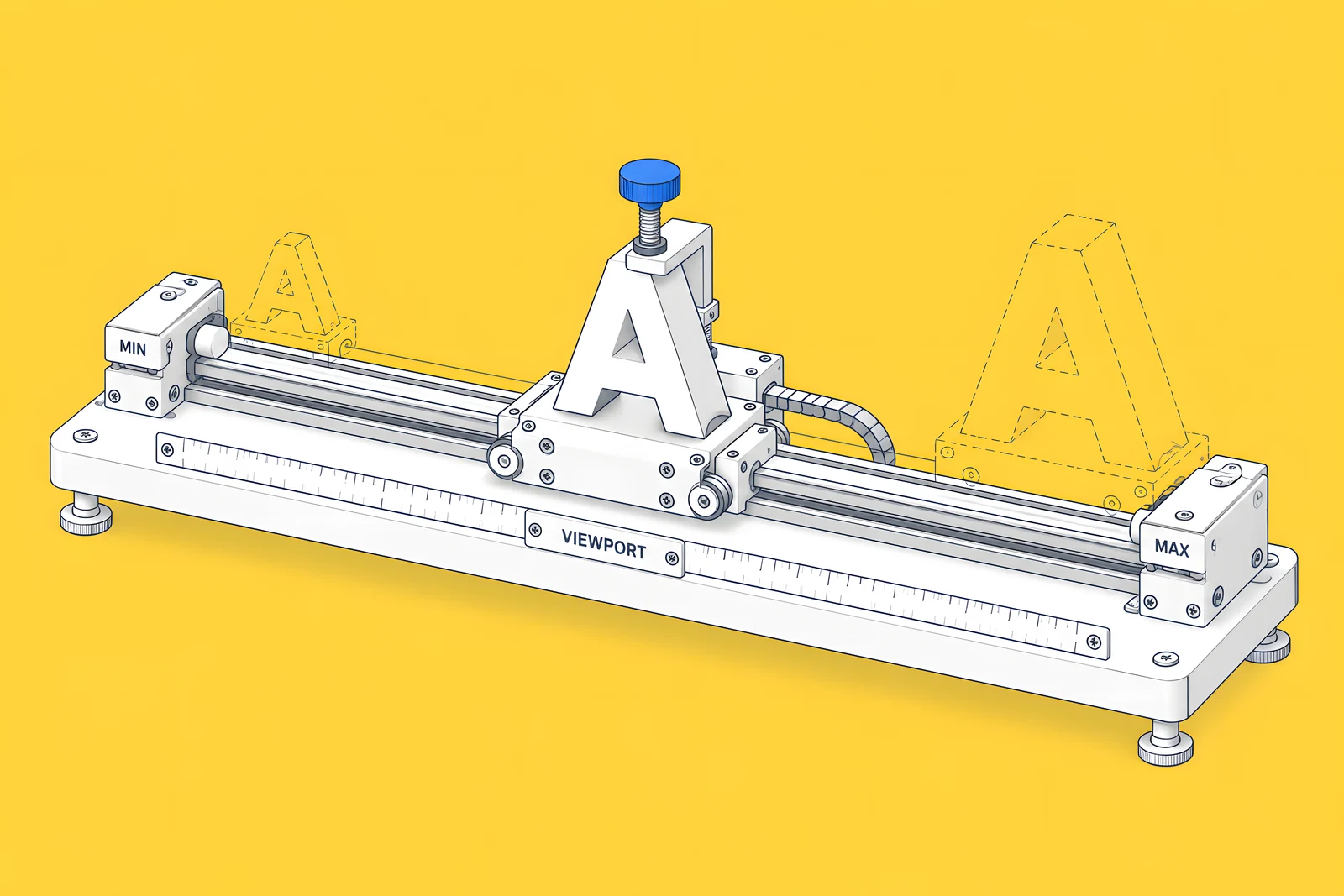
MDN's clamp() reference explains the syntax: “The function takes three parameters: a minimum value, a preferred value, and a maximum allowed value.” For fluid type, the preferred value is a straight line between two points: your minimum size at a small viewport and your maximum size at a large one.
The arithmetic for a heading that should be 32 px at a 375 px viewport and 56 px at a 1,440 px viewport (root font size 16 px):
- Slope = (56 - 32) / (1,440 - 375) = 0.02254, which is 2.2535vw.
- Intercept = 32 - 0.02254 x 375 = 23.5493 px, which is 1.4718rem.
- Result: clamp(2rem, 1.4718rem + 2.2535vw, 3.5rem).
MDN adds an accessibility point for text: keep the maximum a relative unit at least twice the minimum, so text can still scale to 200% when a visitor zooms. Our heading example (2rem to 3.5rem) does not meet that ratio, so test it at 200% browser zoom before you ship it. The calculator below does the arithmetic and shows the ratio.
How do variables work with classes, tags and components?
Webflow's design system article describes the layers: variables store reusable values; classes apply CSS properties to any element; tags apply default styling to HTML elements such as headings and paragraphs without a class; components are reusable building blocks; and Shared Libraries carry these across sites in a Workspace.
In practice, the layers stack like this:
- Variables hold every raw value.
- Tag styles set the defaults: body, H1 to H6, paragraphs, links. Each property points at a variable, so rich text from the CMS inherits the system without any classes.
- A short list of utility classes covers what tags cannot: spacing helpers, text sizes used out of order, a few layout patterns. Each one also points at variables.
- Components combine elements and classes into reusable parts, such as navigation, buttons, cards, forms and footers. Updates to a component can be synced across every instance on the site.
A common mistake is turning everything into a variable or everything into a component. The widget below sorts typical decisions.
What goes on the style guide page?
One page in the site, usually unlinked from the navigation, that shows every token and core component at its real size. Webflow's design system guidance recommends building “a dedicated style guide page or design system site” as a single source of truth.
A useful page has these sections, in this order:
- Colours: a swatch for each primitive and semantic variable, labelled with the variable name, not just the hex value.
- Typography: each heading level and body size set as real text, so you can see line height and weight together.
- Spacing: the scale shown as blocks, so a designer can see the jump between steps.
- Radius, borders and shadows: one example each.
- Utility classes: the short list, each with a one-line note on when to use it.
- Components: buttons, links, form fields, cards and navigation, with every variant and state.
Our public variable-ready Webflow style guide on Made in Webflow follows this structure. Read from its published stylesheet on 14 Oct 2026, its variables are grouped into base colours (brand, neutral and system), semantic colours for text, backgrounds, borders and links, a typography group for sizes, weights, line heights, gaps and radii, a global-tags group bound to body and heading tag styles, and a small theme group. You can clone it and inspect the Variables panel.
How do Figma variables map to Webflow?
Mostly one to one, if the Figma file is prepared for it. The Figma to Webflow plugin has a Variables tab that exports Figma variables to Webflow variables, and you choose which ones to import in the Figma to Webflow app. Webflow notes that deselecting a variable on import replaces it with a static value, which is exactly the hard-coding you are trying to avoid. Our Figma to Webflow handoff guide covers how to prepare components, variables and styles before that sync.
How do you keep the system tidy after launch?
A style guide decays when anyone can add a variable. Four habits keep it clean:
- One owner. One person approves new variables, utility classes and component variants.
- A change log. A dated line for every token change: what changed, why and who approved it. A shared doc is enough.
- A regular sweep for hard-coded values. Look for colours and sizes set directly in classes and link them to variables.
- Libraries for more than one site. If you run a main site plus microsites, Webflow's Libraries can share variables, components, fonts, tag styles and assets across sites in a Workspace. Shared Libraries are available on all paid Workspace plans.
One technical warning from the Variables documentation: Webflow says to beware of custom code that names non-base collection variables, because their CSS names will change and references may need manual updates. If your custom code or embeds read variables by name, keep a list of them.
For editors, the style guide also explains why the CMS and page templates look the way they do. Our CMS architecture and editor handoff guide covers the editing side.
How ActiveSet does it
ActiveSet is a Webflow Premium Partner based in Bengaluru, India. We build on Finsweet Client-First, with the style guide set up first and reusable components on top. Our usual order is a discovery questionnaire and call, stylescapes, Figma design, the Webflow build, a Markup.io review on staging, then launch, so the tokens are agreed in Figma before the first Webflow page exists.
If you want a design system built this way, see Webflow web design or, if your designs are already in Figma, Figma to Webflow. Our own logos, colours and type are on our brand kit page.
Sources
- Webflow Help Center, Variables, updated 21 Sep 2026, checked 14 Oct 2026
- Webflow Help Center, Using a design system in Webflow, updated 9 Oct 2026, checked 14 Oct 2026
- Webflow Help Center, Libraries, updated 9 Oct 2026, checked 14 Oct 2026
- Webflow Help Center, Figma to Webflow plugin and app, updated 8 Sep 2026, checked 14 Oct 2026
- MDN, clamp(), checked 14 Oct 2026
- Webflow (with Vanson Bourne), The 2026 State of the Website, survey June to July 2025
- Finsweet, Client-First, checked 14 Oct 2026
- Webflow Help Center, Disable search engine indexing, updated 8 Sep 2026, checked 14 Oct 2026
- ActiveSet, Variable-ready style guide on Made in Webflow, checked 14 Oct 2026
Frequently Asked Questions
Five: colour, size, percentage, number and font family. Colour variables cover text, backgrounds, borders and gradient stops; size variables cover spacing, layout, typography, radius and shadows; percentage and number variables cover values such as opacity, line height and font weight; font variables hold font families. Webflow also accepts functions such as calc() and clamp() inside variable values.
Yes. Webflow's Variables documentation says functions such as calc() and clamp() can be used in variable values, so you enter the full clamp() expression as the size variable's value. Keep the minimum and maximum in rem, and test text at 200% browser zoom, because MDN warns that viewport-based sizes can stop text scaling when a visitor zooms.
Usually not. It is a working page for your team, not content for visitors, so keep it out of navigation and switch off the Sitemap indexing toggle in its page settings, which adds a noindex tag. Do not delete it after launch: it is the reference editors and new designers use, and Webflow's design system guidance treats it as the single source of truth.
Yes, through Shared Libraries. A Library shares components, variables, fonts, tag styles and assets from one source site to other sites in the same Workspace. Shared Libraries need a paid Workspace plan, and Webflow recommends a separate design system site as the source.