All examples/Scored examples

19 SaaS pricing page examples, scored on one rubric

19 real B2B SaaS pricing pages, each with our own screenshots, a short critique and a score out of 10 on five criteria: message clarity, proof, path to contact, speed and accessibility basics. The set covers seat-based, usage-based, free-first and contact-sales models, so you can see how each model handles the same job: letting a buyer pick a plan without a call.

Reviewed
October 29, 2026
by
ActiveSet
How we score
Notion pricing page
Notion
Pricing page

Notion pricing page

10
/10Message
2
Proof
2
Path
2
Speed
2
Access
2

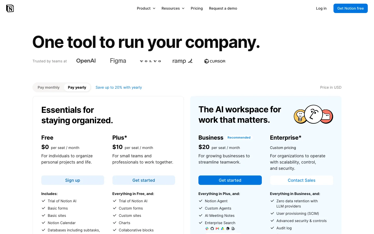
Notion leads with a plain promise, "One tool to run your company.", a "Trusted by teams at" logo row and an attributed quote from Nick Erdenberger, GTM at OpenAI, beside the plan cards. The model is per-seat tiers: Free $0, Plus $10 and Business $20 "per seat / month", Enterprise "Custom pricing", with a monthly/yearly toggle and "Save up to 20% with yearly". A sticky header repeats the buy buttons through a long comparison table, and seventeen "Questions & answers" cover billing edge cases. Buyers may stall on the asterisks beside Plus and Enterprise, explained only by "Plans may not be available for every workspace" far below, and on jargon such as "500 Select credits / month".

What to copy:

Put one attributed customer quote beside the plan cards and repeat the buy buttons in a sticky header over the comparison table.

What we would fix:

Explain the Plus and Enterprise asterisks next to the cards and define AI credits where they are first mentioned.
Intercom pricing page
Intercom
Pricing page

Intercom pricing page

9
/10Message
1
Proof
2
Path
2
Speed
2
Access
2

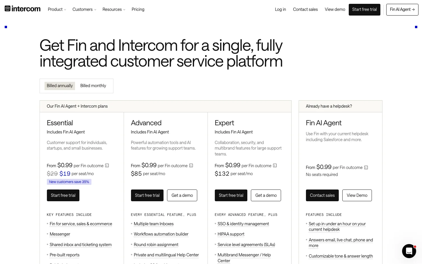
The first screen does most of the work: a billing toggle, three plans with a one-line audience each ("Customer support for individuals, startups, and small businesses") and a separate "Already have a helpdesk?" column for Fin on its own. Each of the three plans pairs "Start free trial" with "Get a demo", so a buyer never hits a dead end. The model is hybrid: a per-seat price plus "From $0.99 per Fin outcome", a usage unit that needs the info tooltip and the "Calculate costs" tool before a buyer can estimate a monthly bill. Proof is one attributed quote from Shane McCarty of [solidcore], with Robin and Synthesia as tabs; "Thousands of businesses" shows no source. The FAQ explains seats versus usage plainly.

What to copy:

Put a plain one-line audience under each plan name and pair every primary button with a lower-commitment option.

What we would fix:

Show a worked example of seats plus outcomes beside the cards so the usage unit is understood without the calculator.

Linear pricing page
Linear
Pricing page

Linear pricing page

8
/10Message
2
Proof
1
Path
2
Speed
2
Access
1

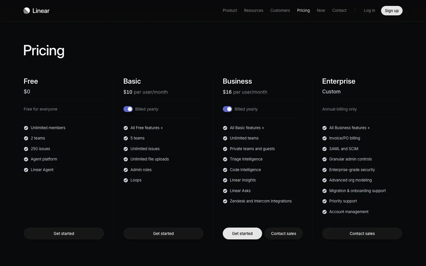
Linear's pricing page is the minimalist benchmark: four columns, no images, and every limit stated in words ("2 teams", "250 issues", "Unlimited file uploads"). The billed-yearly toggle sits inside each paid column, so the price you see is the price you pay. Proof is one line, "Trusted by more than 40,000 companies", with six logos and a link to customer stories; it does the job without a testimonial carousel. The long feature matrix below is grouped by capability (Core, AI and agent workflows, Security, Support), which answers "what do I lose on Free" faster than a per-plan list would. Every self-serve tier ends in "Get started"; only Enterprise is contact-sales.

What to copy:

State the limits that change between plans in words, not icons, and keep the billing toggle next to the price it changes.

What we would fix:

Mark the plan most teams pick, and give the billing toggle and the two icon links accessible labels.

Loom pricing page
Loom
Pricing page

Loom pricing page

8
/10Message
2
Proof
1
Path
2
Speed
2
Access
1

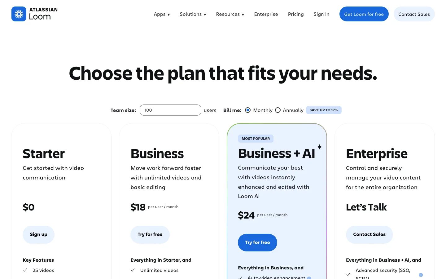
Loom's first screen answers the pricing question at once: "Choose the plan that fits your needs." sits above a "Team size" field, a "Bill me: Monthly / Annually" switch with "SAVE UP TO 17%", and four cards, Starter $0, Business $18 and Business + AI $24 "per user / month", Enterprise "Let's Talk", with the AI tier marked "MOST POPULAR". A sticky comparison header repeats "Sign up", "Try for free" and "Contact Sales" through a long feature table. Proof is thinner: "More than 25 million people across 400,000 companies choose Loom" shows no source on the page, and the logo strip sits below the FAQs. In the capture the "Team size" field shows 100 and no price visibly changes with it, which may puzzle buyers.

What to copy:

Keep the billing switch and per-user price on the first screen, and repeat plan CTAs in a sticky header over the comparison table.

What we would fix:

Make the team-size field update a visible total, or remove it, and move one attributed customer quote beside the cards.

Cal.com pricing page
Cal.com
Pricing page

Cal.com pricing page

8
/10Message
2
Proof
1
Path
2
Speed
2
Access
1

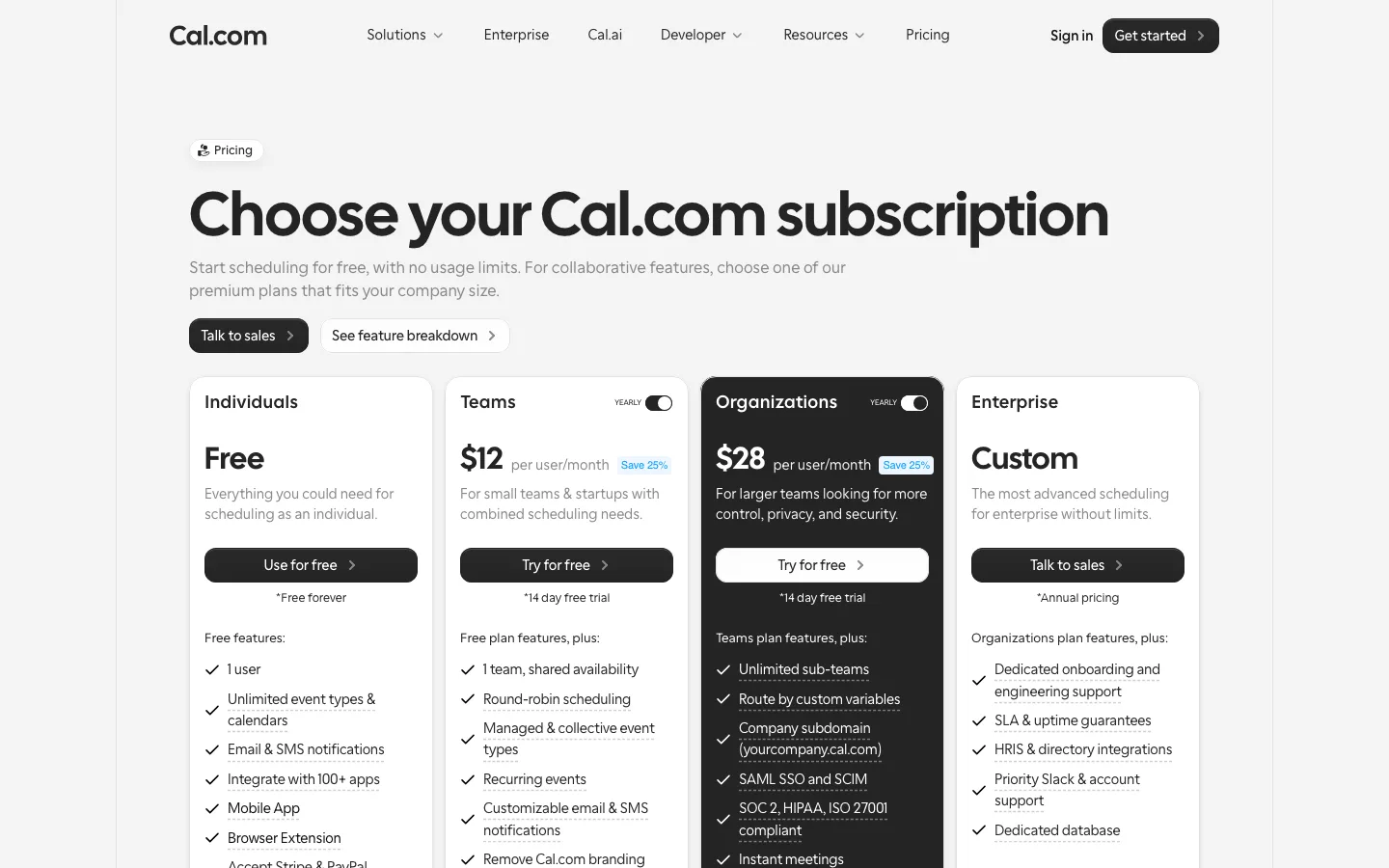
Cal.com puts four cards on the first screen: "Individuals Free", "Teams $12 per user/month", "Organizations $28 per user/month" and "Enterprise Custom", each with a fit line and a note like "*14 day free trial". Unit and period are plain, though the small "YEARLY" toggle suggests the shown price is the annual rate. The model is seat-based tiers with a long "Feature breakdown" table that repeats the four CTAs at its head. Proof is a logo row ("Trusted by fast-growing companies around the world") and Product Hunt, Google and G2 star badges, with no quotes or numbers. The breakdown intro, "Compare our Free and Teams plans to see why Cal.com is the better choice", reads as copy that may be out of date.

What to copy:

Show price, unit and period together ("$12 per user/month") and label the trial or billing condition under every button.

What we would fix:

Add one attributed quote or a review score with its count near the cards, fix the heading skip, and rewrite the breakdown intro line.

Figma pricing page
Figma
Pricing page

Figma pricing page

7
/10Message
1
Proof
1
Path
2
Speed
2
Access
1

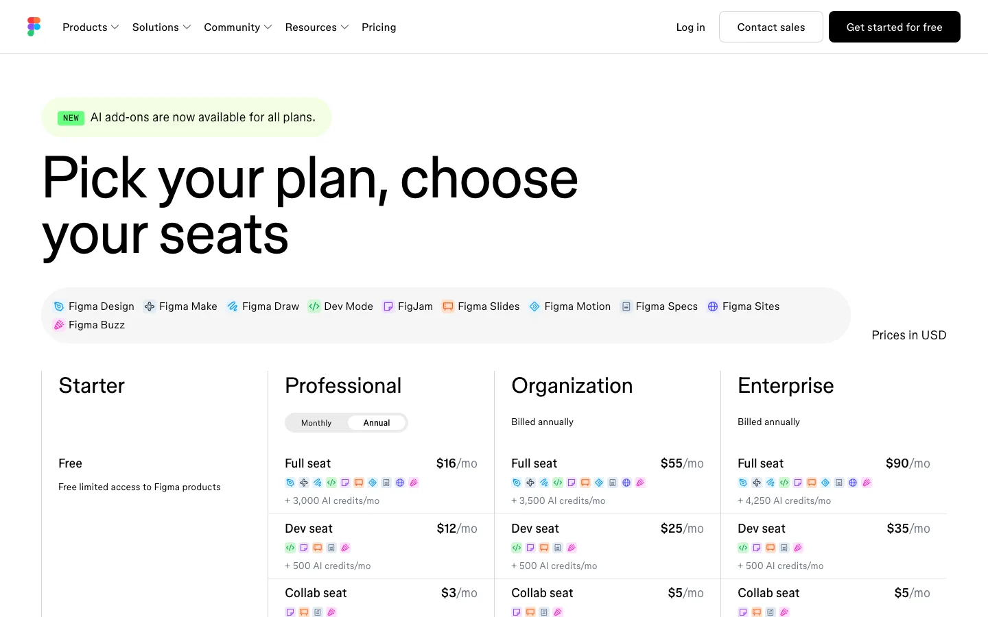
Figma's headline, "Pick your plan, choose your seats", names the model plainly: four plans (Starter, Professional, Organization, Enterprise) crossed with three seat types, each priced "/mo" with "Billed annually" on the upper tiers and "Prices in USD" stated. Product chips show which tools each seat unlocks, and a "Choose Professional if you:" block under each column helps self-selection. The friction is the two-axis grid: a newcomer must understand "Full seat", "Dev seat" and "Collab seat" before any price makes sense, and that definition sits in "What is a seat?" near the bottom of the page. The only proof is a "TRUSTED BY TEAMS AT" logo strip above the footer, with no quotes or numbers.

What to copy:

Under each plan, add a short "Choose X if you:" list so buyers can self-select without reading the comparison table.

What we would fix:

Define Full, Dev and Collab seats in one line above the grid instead of in the FAQ at the bottom.

Attio pricing page
Attio
Pricing page

Attio pricing page

7
/10Message
2
Proof
1
Path
2
Speed
1
Access
1

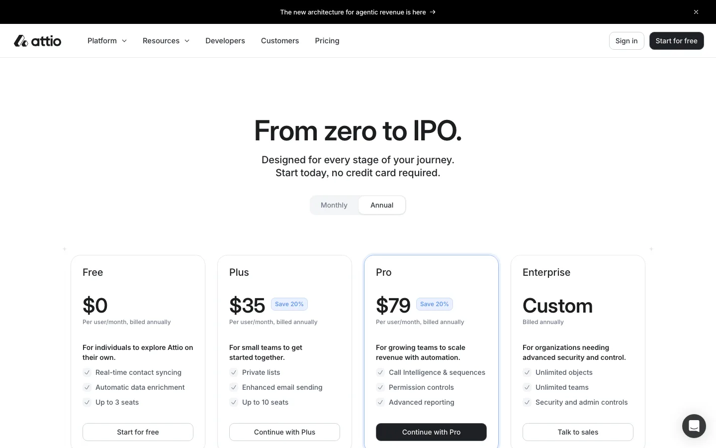
A clean per-seat layout. Under "From zero to IPO." the subhead says "Start today, no credit card required", a Monthly/Annual toggle sits above four cards, and each card states the price, "Per user/month, billed annually", a "Save 20%" chip and an audience line such as "For small teams to get started together". Pro is outlined as the default. Buttons escalate from "Start for free" to "Continue with Plus", "Continue with Pro" and "Talk to sales", and the row is pinned above the comparison table. Credits are the one hard part: "Seat credits" and "Workspace credits" with add-on tiers from $70 to $475 a month need the FAQ to decode. Proof is a logo wall (Granola, Modal, Railway) with no quotes.

What to copy:

Repeat the plan buttons as a pinned row above the comparison table so the next step is always one click away.

What we would fix:

Add one attributed customer quote near the cards and explain credits in a sentence under the toggle, not only in the FAQ.

Clay pricing page
Clay
Pricing page

Clay pricing page

7
/10Message
1
Proof
2
Path
2
Speed
1
Access
1

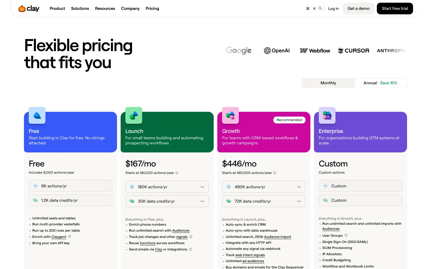
Clay's first screen shows four plans with a "Recommended" badge, a Monthly/Annual toggle ("Save 10%") and a one-line fit note per plan, such as "For small teams building and automating prospecting workflows". Prices read "$167/mo" and "$446/mo". The model is usage-based: each plan bundles "actions/yr" and "data credits/yr", but what an action is only appears below the fold in the "Usage-based pricing" block, and the captured page does not say whether the price is per seat or per workspace. Proof is specific: a hero logo row plus result cards like "HEX +50% lift in win-rate" and "RIPPLING 2x cold email performance". One oddity: the Free plan's button also says "Start 14-day trial".

What to copy:

Put a one-line fit note and a "Recommended" badge on each plan, then back the price with named-customer result cards.

What we would fix:

Explain "actions" and "data credits" next to the prices, state per-seat vs per-workspace, and give the Free plan its own button label.

Resend pricing page
Resend
Pricing page

Resend pricing page

7
/10Message
2
Proof
2
Path
2
Speed
1
Access
0

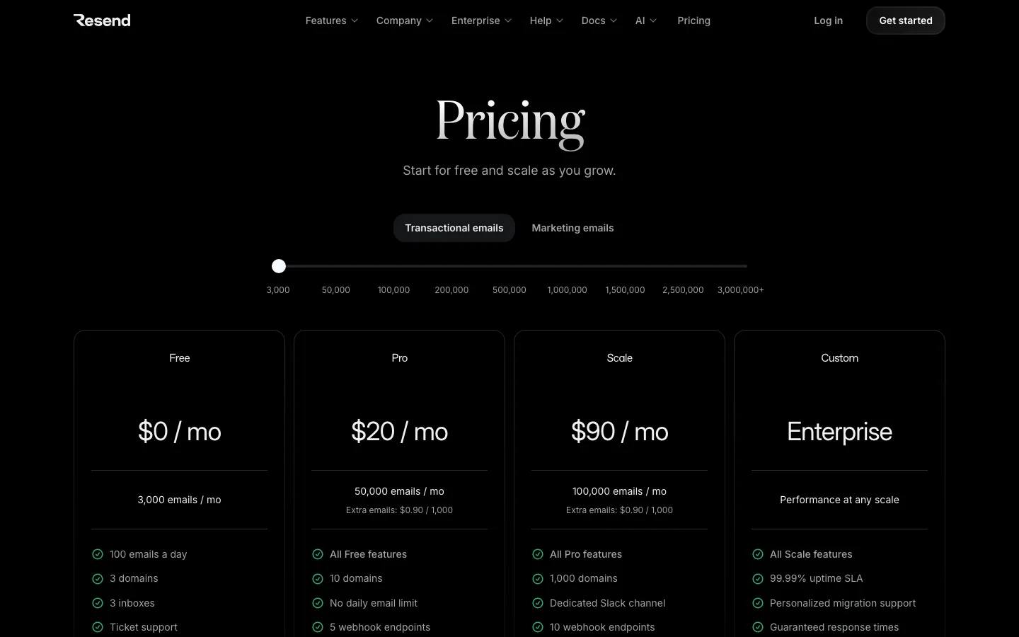
Resend's first screen pairs a Transactional/Marketing toggle and a volume slider (3,000 to 3,000,000+) with four cards: "$0 / mo" for "3,000 emails / mo", "$20 / mo" for 50,000, "$90 / mo" for 100,000 and "Enterprise". Overage is stated as "Extra emails: $0.90 / 1,000", so the unit, period and ceiling are all in view. The model is volume tiers plus priced add-ons ("Domains - $20 / mo", "Dedicated IPs - $30 / mo", "Single Sign-On - $150 / mo") and pay-as-you-go cards. Proof is attributed quotes from Mintlify, MrBeast and Infisical, but they sit at the bottom of a 9,500px page. Three identical "Get started" buttons give no hint of which plan to pick.

What to copy:

State the included volume and the overage rate under each price so buyers can estimate their bill without a calculator.

What we would fix:

Move one attributed quote up beside the cards, label the slider and fix the heading skip, and give the plan buttons distinct labels.

Railway pricing page
Railway
Pricing page

Railway pricing page

7
/10Message
1
Proof
2
Path
2
Speed
1
Access
1

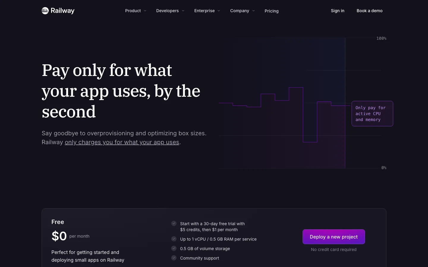
Railway leads with the model, not a price table: "Pay only for what your app uses, by the second", a usage chart and a Free card marked "No credit card required". Hobby "$5 minimum usage" and Pro "$20 minimum usage" sit below the fold, each with its own deploy button, then raw unit rates like "$0.00000386 per GB / sec". A long "Compare features" table serves detail-seekers. Proof is specific: Dillon Chen of Common says "We cut our hosting costs by 75%". Where a buyer could get stuck: the Free card reads "$0 per month" and "then $1 per month" in one box, "minimum usage" is explained only in the FAQ, and "Most customers save ~40%" shows no source.

What to copy:

State the billing model in the headline and give every plan its own deploy button, with the free option saying "No credit card required".

What we would fix:

Make the Free card say one thing ($0 trial, then $1), explain "minimum usage" beside the price, and source the "~40%" claim.

Gong pricing page
Gong
Pricing page

Gong pricing page

7
/10Message
1
Proof
2
Path
1
Speed
1
Access
2

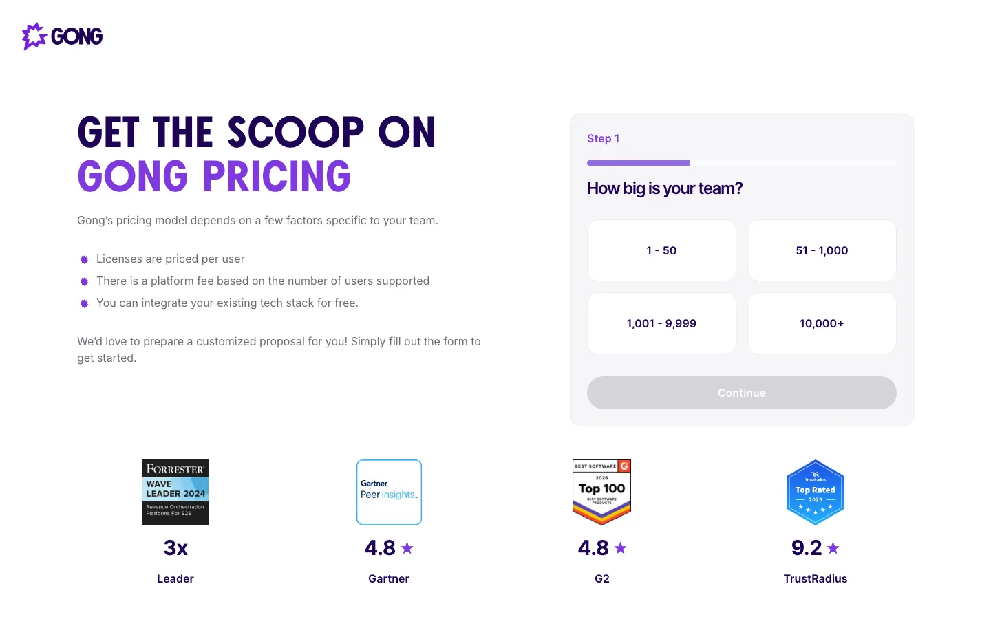
Gong's page is a quote-request landing page, not a price list, and says so: "Gong's pricing model depends on a few factors specific to your team", then plain lines such as "Licenses are priced per user" and "There is a platform fee based on the number of users supported". The stepped form ("Step 1", "How big is your team?") lowers the effort of asking, and four third-party badges with scores (Forrester Wave Leader 2024, Gartner 4.8, G2 4.8, TrustRadius 9.2) sit beneath. Where a buyer could get stuck, in the capture: no navigation, no plan names, no "from" price, no trial or demo link, and "Continue" stays grey until a team size is picked. At 121 words, the page gives a researcher little to compare.

What to copy:

If you can't show prices, say in three plain lines how pricing works and put rated third-party reviews right under the form.

What we would fix:

Add plan names with who each is for, a "from" price or range, and a lower-commitment option such as a demo or pricing guide.

Supabase pricing page
Supabase
Pricing page

Supabase pricing page

7
/10Message
2
Proof
1
Path
2
Speed
1
Access
1

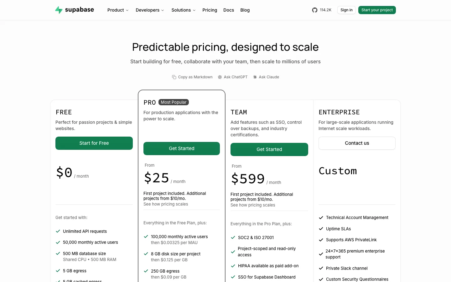
Supabase puts four plans side by side on the first screen: "FREE" at $0, "PRO" tagged "Most Popular" from $25 a month, "TEAM" from $599 and "ENTERPRISE" at "Custom". Each card says who it is for in one line and prints the overage rate under each limit ("then $0.00325 per MAU"). The pattern is a flat plan fee plus metered usage, and the page adds safeguards: a "Spend Cap On" toggle on Pro, a compute calculator ("see your total cost") and FAQs like "Can I cap my usage so my bill doesn't run over?". A buyer could stall in the very long comparison table, and no named customers appear in the capture.

What to copy:

Print the overage rate directly under every included limit, so the plan price and the scaling cost sit together.

What we would fix:

Add two or three named customers or a short quote near the plan cards, and collapse the comparison table's sections by default.

Mercury pricing page
Mercury
Pricing page

Mercury pricing page

7
/10Message
2
Proof
0
Path
2
Speed
2
Access
1

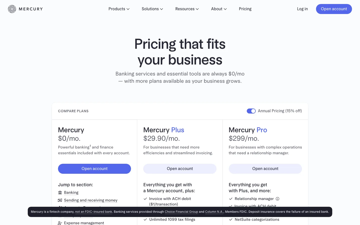
Mercury's first screen answers the main question in one line: "Banking services and essential tools are always $0/mo". Three cards follow, "Mercury" at $0/mo., "Mercury Plus" at $29.90/mo. and "Mercury Pro" at $299/mo., with an "Annual Pricing (15% off)" toggle on by default, so the monthly-billing figure takes a click to see. Add-ons are priced on the card itself ("Mercury Books", "$35/mo, waived until Dec 31, 2026"), and Pro offers "Get in touch" for custom pricing. All three buttons read "Open account", so the button does not say which plan a buyer is choosing. In our capture no customer names or quotes appear, and a fixed disclaimer bar covers part of the first card's "Jump to section" links.

What to copy:

State the always-free baseline in the subheading, then price every add-on on the plan card instead of in a footnote.

What we would fix:

Default the toggle to monthly billing, label each button with its plan name, and add named customers near the cards.

Webflow pricing page
Webflow
Pricing page

Webflow pricing page

6
/10Message
1
Proof
1
Path
2
Speed
1
Access
1

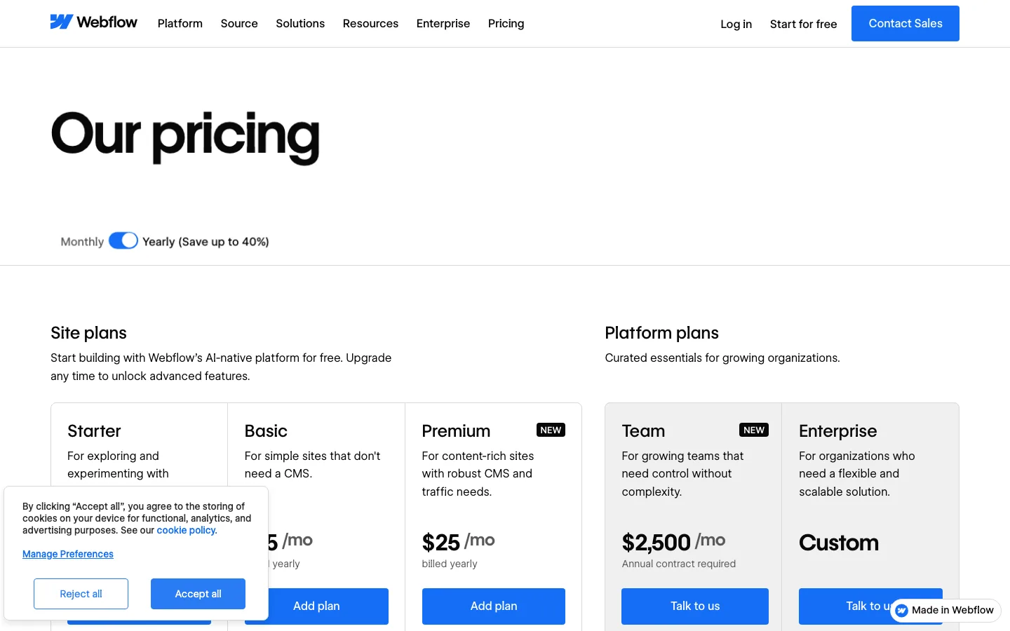
The page opens with a Monthly/Yearly toggle ("Save up to 40%") and splits plans into "Site plans" and "Platform plans", each card carrying a short audience line such as "For content-rich sites with robust CMS and traffic needs". Buttons are consistent: "Add plan" for self-serve tiers, "Talk to us" for Team and Enterprise, and the free Starter plan returns at the foot. The unit, "All prices in USD, per site", appears only after the cards, and Ecommerce and Workspace plans sit collapsed further down, so a buyer must learn the plan taxonomy first. In this capture the cookie banner covered the Starter and Basic prices. Proof is a logo strip (Reddit, Docusign, The New York Times) without quotes.

Disclosure: ActiveSet is a Webflow Premium Partner and earns a commission from Webflow on Webflow plans.

What to copy:

Use one verb per intent: "Add plan" for self-serve tiers and "Talk to us" for sales-led tiers, so the next step is never ambiguous.

What we would fix:

Put "per site" and the Site vs Workspace explainer above the cards, and keep the consent banner clear of the price column.

Cursor pricing page
Cursor
Pricing page

Cursor pricing page

6
/10Message
1
Proof
1
Path
2
Speed
1
Access
1

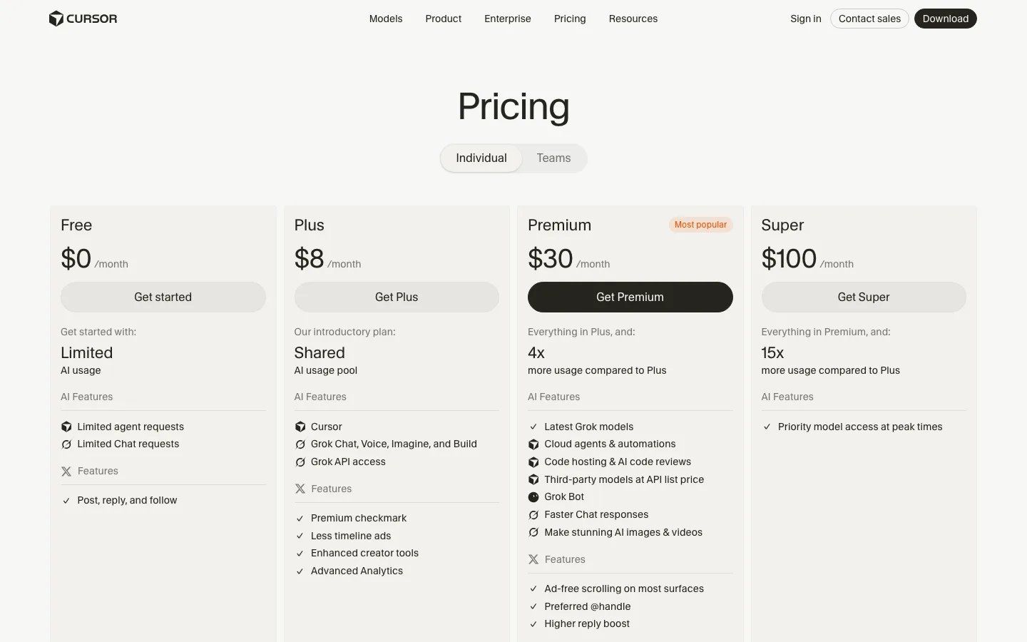
Cursor puts the decision on the first screen: an "Individual / Teams" toggle and four cards, "Free $0 /month", "Plus $8 /month", "Premium $30 /month" marked "Most popular", and "Super $100 /month", each with a button. Tiers are separated by usage multiples ("4x more usage compared to Plus", "15x"), tidy but abstract: a buyer cannot tell how many agent requests that buys. The lists mix Cursor items with "Grok Chat, Voice, Imagine, and Build" and "Less timeline ads", so the bundle needs explaining. The small print: "Third Party model usage in Cursor is not included in the monthly prices shown". No customer names, quotes or reviews appear, only a footer line, "SOC 2 | ISO27001 | ISO42001 | AIUC-1 Certified".

What to copy:

Put every plan's price, period and button in the first screen, and mark one "Most popular" so the default choice is obvious.

What we would fix:

Translate "4x" and "15x" into concrete monthly usage, and add one named customer or review near the cards.

Ramp pricing page
Ramp
Pricing page

Ramp pricing page

6
/10Message
1
Proof
1
Path
2
Speed
1
Access
1

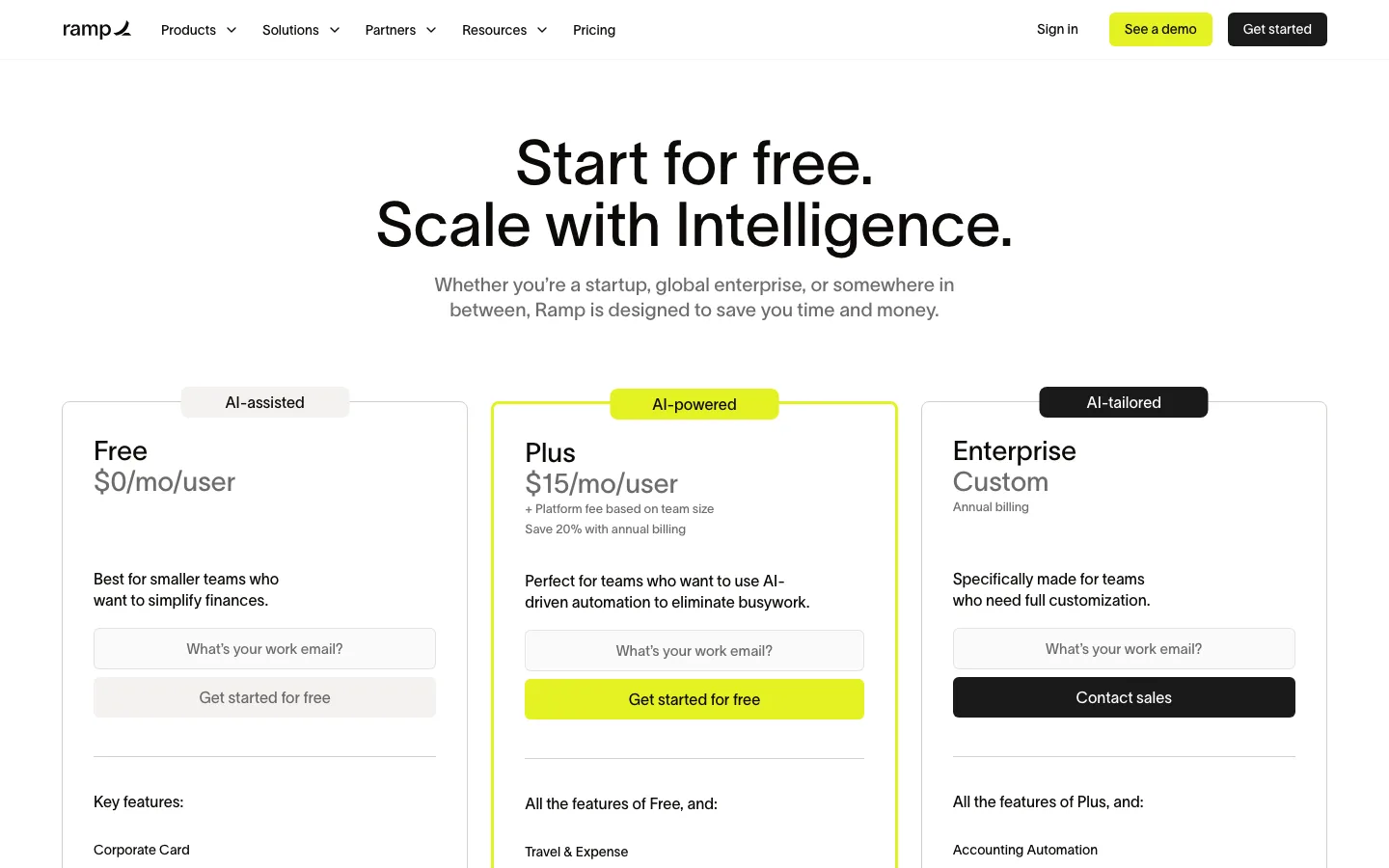
Ramp opens with "Start for free. Scale with Intelligence." and three cards: "Free" at $0/mo/user, "Plus" at $15/mo/user and "Enterprise" at "Custom". Unit and period are plain, and each card carries an email field with "Get started for free" or "Contact sales", repeated three more times down the page. The catch is the Plus line "+ Platform fee based on team size": the number a buyer would actually pay is not on the page. Proof is a logo row (Stripe, Notion, Discord, Eventbrite) under "85,000+ finance teams have saved millions of hours with Ramp", a claim with no source shown on the page. The long comparison sits under collapsible headings, and the FAQ answers "Is there a free version of Ramp?".

What to copy:

Put an email field and the primary button inside every plan card, then repeat the same pair after the table and the FAQ.

What we would fix:

Show the Plus platform fee bands on the page, and give the "85,000+" claim a date or source next to the logos.

Vercel pricing page
Vercel
Pricing page

Vercel pricing page

5
/10Message
1
Proof
0
Path
2
Speed
1
Access
1

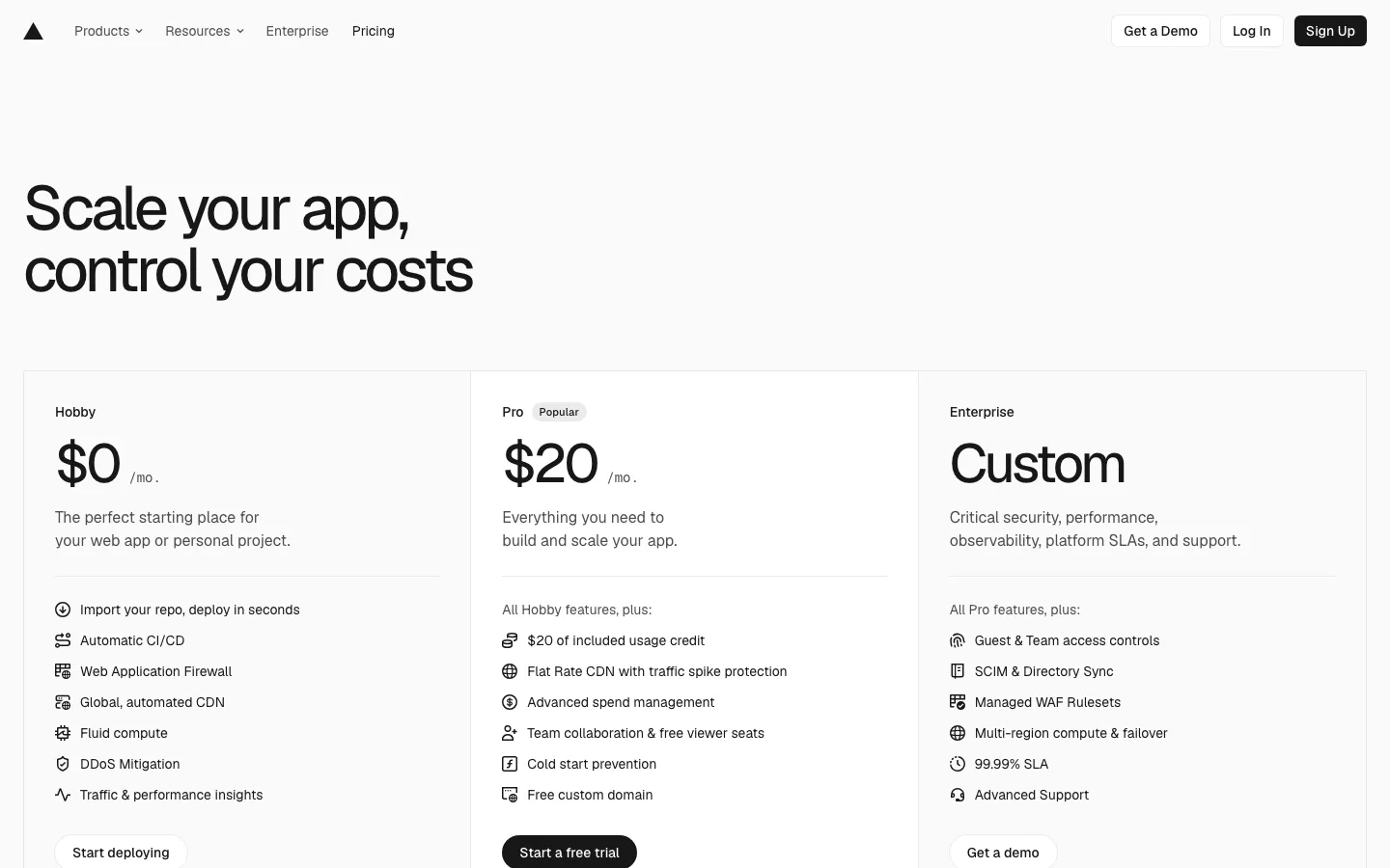
Vercel opens with "Scale your app, control your costs" and three plans: Hobby $0/mo, Pro $20/mo marked "Popular", Enterprise "Custom", each with a one-line fit statement and a short feature list, plus a note that prices are in USD and exclude tax. The real model is usage-based: a very long table lists metered rates such as "Starting at $0.128 per hour" for Fluid Active CPU and "$20 / month" per developer seat, with a "Search feature..." box to find a line. That seat price lives only in the table, so the first screen's "$20 /mo" reads like a flat fee. The capture shows no customer logos, quotes or numbers, and the lower part of the page did not render.

What to copy:

Pair a simple three-card summary with a searchable, sectioned rate table so quick buyers and finance can both find their number.

What we would fix:

Say "per seat" next to the $20 and add one attributed customer proof point near the plan cards.

Ahrefs pricing page
Ahrefs
Pricing page

Ahrefs pricing page

5
/10Message
2
Proof
1
Path
2
Speed
0
Access
0

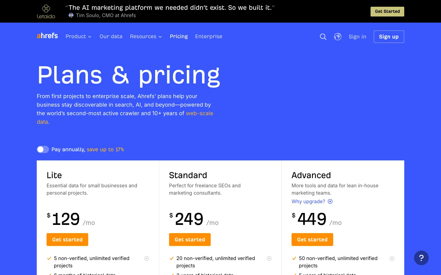
The core is readable at a glance: a "Pay annually, save up to 17%" toggle, then Lite, Standard and Advanced at $129, $249 and $449 a month, each with a one-line audience such as "Perfect for freelance SEOs and marketing consultants" and an orange "Get started". Per-user pricing is explicit ("1 user included", "Add 2 more users at $40/mo each") and the long comparison table answers limit questions. The page then stacks Enterprise, Starter, Ahrefs Free, Brand Radar packages and four add-ons, so a buyer unsure which tool they need can lose the thread. Proof is thin: the only quote is a banner about Letaido rather than a customer, and "trusted by Fortune 500 teams" comes with no customer names shown on the page.

What to copy:

State what extra users cost inside the plan card so the per-seat maths is done before the buyer reaches the table.

What we would fix:

Add two or three named customers near the cards and move the free tier up so first-time buyers see it before the add-ons.

PostHog pricing page
PostHog
Pricing page

PostHog pricing page

5
/10Message
1
Proof
1
Path
1
Speed
1
Access
1

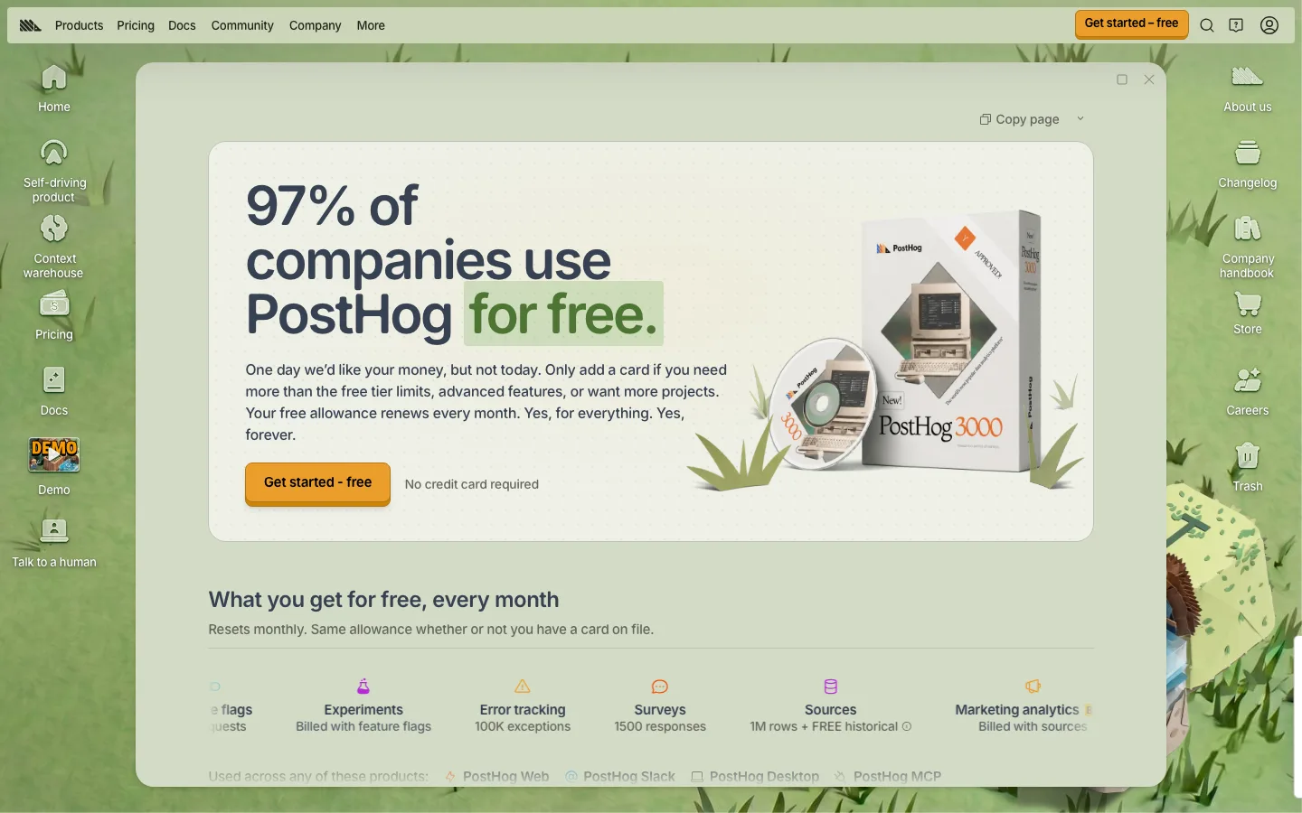
PostHog's first screen is a headline, "97% of companies use PostHog for free.", and a plain-spoken paragraph: "One day we'd like your money, but not today." Below it, "What you get for free, every month" lists per-product allowances such as "100K exceptions" and "1500 responses". The visible screen lists per-product free monthly allowances, but no paid rate or plan appears in it, so a buyer cannot yet tell what scale would cost. The single path is "Get started - free" with "No credit card required", plus a sidebar "Talk to a human". The page renders inside a desktop-style window that scrolls internally, which stopped our full-page capture at the first screen.

What to copy:

Lead with the free allowance in plain words and say "No credit card required" right under the button.

What we would fix:

Show the paid rate per product next to the free allowance, cite the source for "97%", and cut the 18 s lab LCP.

What to copy from these pages

  • State the limits that change between plans in words a buyer can scan, not icons.
  • Keep the billing toggle next to the price it changes.
  • Give every self-serve tier one primary action and leave contact-sales to the top tier only.

Questions about these examples

How are these pricing pages scored?

Each page gets 0, 1 or 2 points on five criteria, for a score out of 10. The rubric and the method are published on the examples hub, and a named reviewer checks every score before a page is published.

Are the screenshots current?

They are our own captures, taken on the reviewed date shown on each teardown, and refreshed each quarter. Pages change; the teardown links to the live page so you can compare.

Can you score our pricing page?

Yes. Send us the page and we score it on the same five criteria and tell you what to fix first.

Get your page scored with the same rubric

Send us the page you want reviewed. We score it on message clarity, proof, path to contact, speed and accessibility, and tell you what to fix first.

Get a Free Conversion Audit